
Open the websites of any ten nutrition coaches at random and you’ll see something interesting. The ones that look the most premium aren’t necessarily the ones with the biggest businesses, the longest experience, or the most expensive logos. They’re the ones whose entire brand feels intentional — every page, every email, every PDF, every Instagram post visibly belonging to the same business.
That’s not a coincidence, and it’s not a budget question. The single biggest determinant of how premium a coaching brand looks is consistency. The single biggest reason most coaching brands look amateur is the absence of it — different fonts on different pages, mismatched colours between the website and the recipe cards, photography style that changes from post to post.
You can solve that problem for under $200 in the first year. This guide shows you how. It’s a working playbook for nutrition coaches and personal trainers who want a genuinely professional brand without an agency budget — and who want to spend the saved money on the things that actually grow a business.
What "premium" actually means in 2026
Premium isn’t a price point. It’s a feeling clients have about your business — and that feeling is built almost entirely from the visual and experiential signals they pick up before they ever speak to you.
In practice, premium-feeling brands share three things, and none of them require money:
- They look intentional. Every choice — colour, font, image style, layout — feels deliberate rather than default. Even simple brands feel considered.
- They look consistent. Whatever the choices are, they’re applied uniformly. The recipe card matches the website matches the Instagram post matches the email signature.
- They look uncluttered. Premium brands are built on restraint. Less type. Fewer colours. Cleaner layouts. The opposite — busy designs with too many fonts and colours — is one of the strongest signals of an amateur brand.
Notice what’s not on that list. Custom illustrations. Bespoke photography. Six-figure logo redesigns. None of it actually moves the needle on perceived premium when consistency and restraint are missing. And all of it is essentially decorative when those two things are already in place.
The cheapest premium brand and the most expensive amateur brand both exist. The difference between them is discipline, not budget
The seven brand elements every coach needs
Before getting into how to build them, it’s worth being explicit about what “a brand” actually consists of in practical terms. Most coaches over-think this and end up with twenty half-finished pieces. The reality is that a complete coaching brand is built from seven elements — and most of them cost nothing.
| Brand element | Premium signal | What it costs |
|---|---|---|
| Logo | Clean, simple, vector — works at any size | Free (Canva) – $200 (designer) |
| Colour palette | 3–5 colours, picked from a brand kit | Free |
| Typography | 1 heading font + 1 body font, used consistently | Free |
| Photography | Consistent style — neutral tones or bright editorial | $0 with stock libraries |
| Recipe cards & guides | Templated, branded, professional layout | $0 (white-label) – $500/yr |
| Website | Clear navigation, fast loading, mobile-first | $15/mo (Squarespace) |
| Email design | Branded header, consistent template | Free in most ESPs |
Total realistic spend across the seven, even using paid tools where they help, sits comfortably under $500 in the first year. Most coaches can come in well under $200 if they’re willing to use white-label resources for client-facing materials.
Building it — the order of operations
The order matters. Coaches who try to design a website before they’ve settled on colours and fonts almost always end up rebuilding it within six months. The right sequence is foundational decisions first, applied design second, distribution last.
Step 1 — Pick your colour palette
Choose three to five colours and stop there. One primary colour (the one you’ll use most), one or two secondary colours that complement it, and one or two neutrals (a near-black for text, a near-white or warm grey for backgrounds). This is the single highest-leverage decision in your brand — almost everything visual flows from it.
If you’re stuck, look at brands you respect — both inside and outside nutrition — and identify what they have in common. Most premium-feeling coaching brands lean toward calm, neutral palettes with one accent colour, rather than busy multi-colour systems. Coolors.co and Canva’s colour palette generator both produce useable palettes in minutes.
Step 2 — Pick two fonts
One heading font, one body font. That’s the entire typography decision. Resist the temptation to add a third “display” font for accents — coaches who use three or more fonts almost always look amateur, regardless of which fonts they pick.
Safe defaults that work for most coaching brands: a clean serif for headings (Playfair Display, Lora) paired with a clean sans-serif for body (Inter, Lato, Montserrat). Or two sans-serifs in different weights (Inter Bold for headings, Inter Regular for body). Both Google Fonts and Canva’s free font library cover this completely.
Step 3 — Set up a Canva brand kit
This is the operational unlock. Canva’s brand kit feature lets you save your colours and fonts in one place and apply them to any template with one click. The moment you do this, every recipe card, e-guide, social post, and onboarding pack you create going forward stays automatically on-brand.
Setting up a brand kit takes about 20 minutes and is the single highest-leverage thing you can do for brand consistency. After this, the work shifts from “designing each thing from scratch” to “applying my brand to existing templates” — which is a fundamentally faster and more reliable way to operate.
Step 4 — Pick your photography lane
Photography is where most coaching brands quietly fall apart. The website has bright, airy editorial shots. The Instagram feed has dark gym shots and stock photography. The recipe cards use a third style entirely. The result feels disjointed even when every individual image is fine.
Pick one direction and commit. The two lanes that work best for nutrition coaching are: bright editorial (light, neutral tones, natural daylight, considered styling) or warm-confident (slightly warmer colour grading, gym-and-kitchen mix, more energetic). Both work — what matters is choosing one and using it everywhere.
For free or low-cost stock that fits these lanes, Pexels and Unsplash both have strong libraries when filtered for the right colour palette. For paid options, Death to Stock and Haute Stock both produce coherent, premium-feeling sets.
Step 5 — Apply it everywhere
This is the discipline part. Every new asset — every Instagram post, every recipe card, every email — should pass through the brand kit. If it doesn’t match the colour palette, the typography, and the photography lane, it doesn’t go out.
The coaches whose brands look the most premium aren’t the ones with the most assets. They’re the ones whose assets all look like they belong to the same business. This becomes much easier once the brand kit is set up — but it requires the conscious choice to use it.
The single biggest mistake coaches make in brand-building is treating each new asset as a fresh design problem. The brand kit exists so that’s not the case anymore.
Where the budget should actually go
If you have a small budget — say $200 to $500 to invest in your brand in year one — here’s how to spend it for the highest return on perceived value:
1. Client-facing materials (highest ROI)
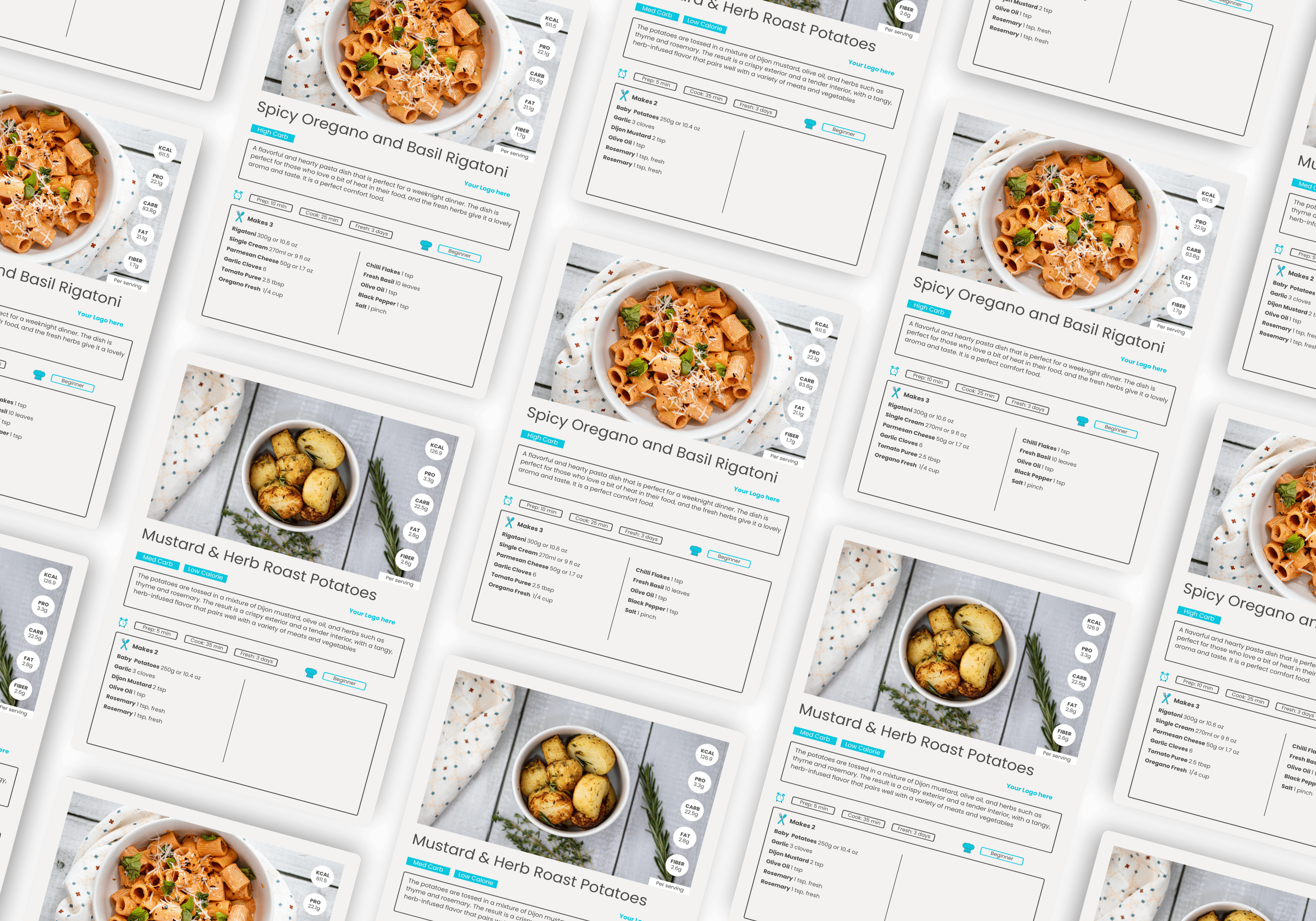
Branded recipe cards, e-guides, onboarding packs, and meal plan templates are the most under-invested-in element of most coaching brands, and they’re the elements clients spend the most time with. A coach whose website is great but whose client materials look thrown together is delivering an inconsistent experience that erodes trust over time.
White-label nutrition resources — like the recipe books and e-guides from The Content Cook — solve this problem at a fraction of the cost of designing materials from scratch. The resources are professionally designed, evidence-based, and rebrand cleanly with your colours and logo through Canva. For the cost of one custom guide from a freelance designer, you get a full library of branded client materials.
2. A working website (second-highest ROI)
You don’t need a custom-designed website. You need a clean, fast, mobile-friendly one with clear navigation, your branding, and an obvious primary call-to-action. Squarespace, Showit, and well-set-up WordPress sites all hit this bar at $15–$30 per month.
The single most under-rated investment here: a strong homepage with one focused message. “I help [audience] [achieve outcome] through [your method].” Coaches who try to be everything to everyone almost always end up with a homepage that says nothing distinctive.
3. A small set of professional photographs
If you have any budget left, a brief professional photoshoot — even just an hour or two — produces images of you that you’ll use across your entire business for years. This is one of the few places where spending $300–$500 once delivers genuinely lasting value, particularly if your brand puts your face in front of clients.
What you don't need
In the spirit of being explicit about where not to spend money:
- You don’t need a custom-illustrated logo. A clean wordmark — your name in your heading font — works perfectly well and looks more premium than 80% of small business logos.
- You don’t need a brand strategist. Most coaches don’t have a brand strategy problem; they have a consistency problem. The difference between the two costs about $5,000.
- You don’t need every social platform. One platform you post to consistently outperforms four you neglect. For most nutrition coaches, that’s Instagram. Some lean toward TikTok or LinkedIn instead — pick one and own it.
- You don’t need motion graphics, animated logos, or video intros. Premium brands at every level lean toward stillness and restraint, not motion.
- You don’t need a podcast on day one. A podcast can be a brand asset, but it’s a years-long investment with very slow audience growth. Build the foundations first.
How to know your brand is working
There are a few honest tests worth applying every six months:
- Take screenshots of your website, your last five Instagram posts, your latest recipe card, your email template, and your onboarding pack. Lay them out side by side. Do they look like they belong to the same business?
- Show the same screenshots to a friend who has never seen your brand before. Ask them to describe the business in three words. Are those the words you’d want?
- Track whether new clients reference how professional your materials feel during onboarding. They will, when the brand is working — and they won’t, when it isn’t.
- Look at your effective hourly rate. Coaches with strong, consistent brands typically charge 30–50% more than coaches with the same credentials and inconsistent branding. The brand is doing real commercial work.
A premium brand isn’t a vanity project. It’s a quiet, compounding asset that lets you charge more, retain longer, and attract better-fit clients — for years.
Frequently asked questions
A capable, professional-looking brand for a nutrition coaching business can be built for under $500 in the first year — often under $200 if you use Canva, free fonts, and white-label resources for client materials. The temptation to spend $2,000+ on agency branding is rarely worth it for new or scaling coaches; the same money is almost always better spent on materials clients actually see and use.
Consistency, not spending. A premium brand uses the same colour palette, fonts, and design language across every touchpoint — website, social media, recipe cards, e-guides, emails, onboarding packs. The single biggest difference between coaches who look premium and those who don’t is whether their materials feel like they belong to the same business or like they were assembled from different sources at different times.
Eventually, but not on day one. A clean wordmark — your name in a well-chosen font — works perfectly well as a starter logo, costs nothing, and avoids the trap of paying $500 for an icon that you’ll outgrow within twelve months. Most well-known coaching brands started with a wordmark and only invested in a custom logo once the business had stabilised.
Canva is the most efficient tool currently available for building and maintaining a coaching brand. It supports brand kits, allows you to apply your colours and fonts across templates instantly, and has a low enough learning curve that you can produce professional materials in minutes once your brand is set up. Most of the highest-perceived-value coaching brands online use Canva — the platform is not the limit; the discipline of using it consistently is.
The materials clients actually receive — branded recipe cards, e-guides, onboarding packs, meal plan templates. These are the touchpoints that build perceived value over the lifetime of a coaching relationship, and they’re the ones most coaches under-invest in. A polished website and a well-designed Instagram feed help with first impressions, but client-facing deliverables are what justify premium pricing and drive retention.
Make every client touchpoint look premium
The Complete Coach Toolkit gives you a full library of nutritionist-developed, professionally designed client materials — recipe books, e-guides, Canva-editable templates, and onboarding resources. Every asset is built to be branded with your colours and logo in minutes, so the materials your clients receive between sessions match the standard of the coaching itself. It’s the foundation of a premium-feeling brand without the agency budget.